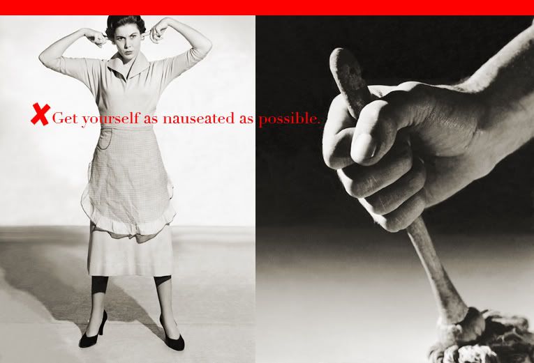
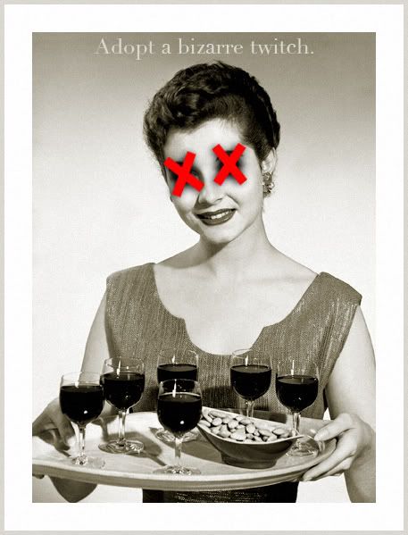
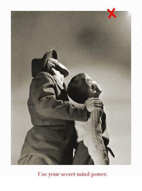
Yesterday I finally took a peek inside and decided to begin messing with some of them,
with no real objective in mind but with an abbreviated and fairly loose set of guidelines, such as,
1. slight sepia toning on the grayscale images,
2. a uniform use of the color red (clearly my Barbara Kruger influence),
3. the continued use of the X motif, a recent favorite and always pregnant with meaning,


No comments:
Post a Comment